Sunday, August 26, 2018

Städel Museum in Frankfurt Part Two

They had two of my favorite Italian paintings from the 16th Century in the same room.  The second I saw that, I may of squealed aloud. 

See the lady in the green dress to the left and the lady in the red dress in the middle with the Cavalier King Charles Pup?  I gasped the second I saw they were right next to each other.

But first....The Holy Family by Garofalo painted between 1515 and 1520.

I love this for many reasons.  First, Saint Joseph, half asleep is wearing a pink garment with a red cloak.  There is no way to deny that that is anything other than bright pink.  Second, Mary's underdress looks lovely.  But third...that firebox.

Here is a close up of the firebox.  It looks almost exactly like the little pull wagon for alphabet blocks, but, clearly, not made of wood.  I think I need one for camping.  

Next, the Lady in Red by Agnolo Bronzino painted in 1533.  

The full painting.  I have seen this SO MANY TIMES in books and on the internet.  However, I never realized her sleeves are a rather nice green and not black.  Seriously they are a lovely green satin when you look at the painting in person.  And lets look at her Balzo more closely.

I thought she just had braids but it's pretty clearly a balzo instead.  Mostly, it looks like a hairnet with a metal headband.  It looks like the hairnet is two-toned as well.

The white work on the camica is only around the neck.  Also, there is a lovely band of trim around the neckline of the dress.

Close up of the sleeve.  Really, it's more green in person.  It's rather shocking how bad the photos come out of the sleeve.

Close up to see the pleats of the upper sleeve.

Another close up to show the lining of the lower sleeve.

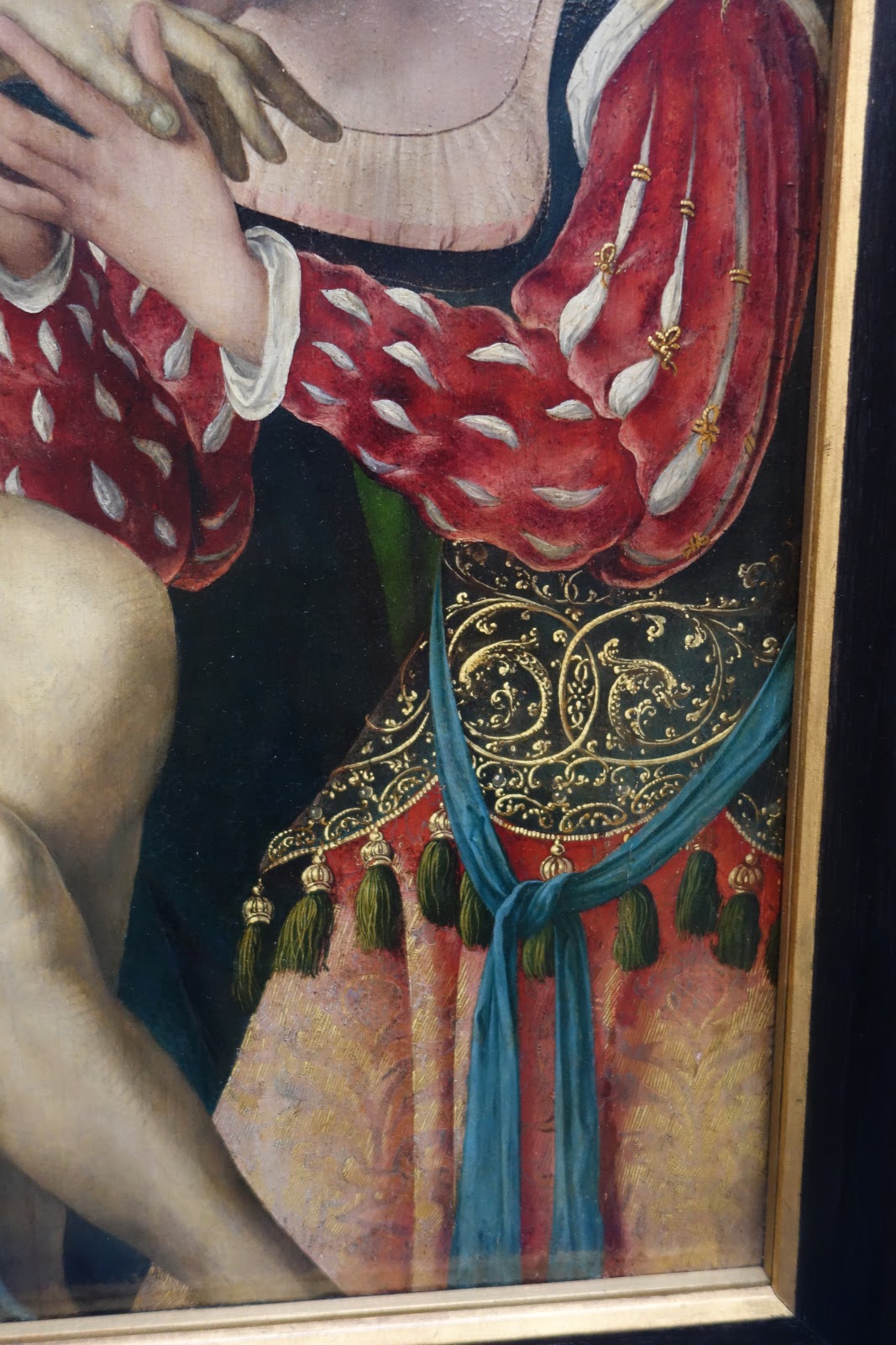
Close up to show the trim a bit better and the scarf belt.

Another close up of the whitework.

The next painting if the Portrait of a Lady by Pieter De Kempeneer painted between 1527 and 1537.  Really, I think it's closer to the 1527 date.  

The full painting.  This is another I've stared at for hours in books and on the internet.  In fact, a decade ago, it was partially the inspiration for my Mom's Renaissance gown.   

First, the balzo.  That is just fabulous.  The jeweled headband with the white silk net around the tied up hair.   I really need to try this.  

The jewelry.  Oh my.  Those earrings!  That pearl necklace with the cameo!  And take a look at the sheer partlet!!!!

Now, the whitework on the camica and the crazy amount of gold trim.  What I found interesting is that the placement of the trim looks like it was "erased" and then put back.  This becomes very apparent on the sleeves in the next picture.

Whitework on the cuffs and the trim placement thing.  You can see where it looks like someone tried to get rid of the gold lines and put them back differently.

A close up of the waistline and the cuffs.  

Close up of the upper sleeve.

Here, I wanted to show the foldy-down waistline of the skirt you see sometimes in Italian dress.  I have no idea why that's there or why they did that but I have seen it in other portraits.


Next, Titian's Portrait of a Young Man from 1510.

This painting is pretty small and there isn't a good way to get close up's of the details.  Still, a rather nice blue doublet and a bright red hat.  

Carpaccio's Virgin and Child with the Infact Saint John from around 1500.

I found this interesting because they are all wearing shades of brown.  

Close up of Mary's sleeves and dress.

Close up of Saint John's cap and tunic.

Here, the museum started to get back into the earlier Medieval items.  This piece from Siena is known as the arrival and reception of Helen of Troy and dates to 1430.

I was amused by the pink houses, I admit.

Next, by Hugo Van Der Goes, a triptych with the Virgin and Child from the last quarter of the 15th C.

First, the triptych overall with the center piece removed.

The Virgin and Child were in the same case, just not in the centerpiece.  

What I liked was the donor's outfit.  It's pretty typical for the late 15th C but notice the black partlet going under the gown.  

The Portrait of Gilberecht von Holzhausen from 1535 really just looks neat.

I now want a crazy coat like that.  Look at that cape top!  That trim!  This is a way to take boring colors and make the garment look fabulous.

Lastly, there is Conrad Faber Von Creuznach's Portrait of Margarete Stralenberger from 1526.

This is her portrait overall.  It's pretty typical for a German portrait.  Still, look at her headgear and her embroidered collar!

Close up of the embroidery.  It's hard to tell but it looks like she might have a gown under the overgown.

Close up of the headgear.  Check out the blackwork!

Close up of the waistline.  I wanted to show the velvet front with the wool (?) overdress.


That's it for this part.  Part three should go up in a couple of days with a lot more paintings.  I'm trying to keep it to about 40 images to a post.  We'll see how well that works.  

Saturday, August 25, 2018

Städel museum in Frankfurt Germany Part one

Friday was COLD in Germany.  It went from being very pleasant in the 80s (F) to being 65F.   I was not pleased.  It was also rainy.  So, rather than trekking to Frankenstein's Castle, I went to the Städel museum.  I'm glad I did although the admission was a bit on the pricey side (€14).   The upper floor is dedicated to Medieval and Renaissance art with a few 17th and 18th C pieces thrown in for good measure as well.

This is what the entrance to the upper floor looks like.  A couple of paintings I found interesting right there are all the way to the right side of the photo, next to the BIG still life.  There are of a couple, most likely both painted in the late 15th Century.

This is the lady wearing a pretty typical 1490's ~ish gown.  Both this one and the matching one were painted by Wolfgang Beurer.

The matching painting of the gentleman.  Love the fur!
Once inside the medieval section, I pretty much geeked out.   There were SO MANY PAINTINGS I had only ever seen in books or online.  SO MUCH DETAIL TO SEE!   SO MANY THINGS TO LOOK AT!  So, the following is brought to you with that in mind.   I geeked out.  Badly.  Ummm...picture heavy post is picture heavy?  

Also, if you use any of the photos, please, just give a link back to my page or, if it's in your documentation, please list it as from Lady Isabella Mea Caterina D'Angelo in SCA documentation.   

I made sure to take photos of all the signage this time.  :-)  So, 1516-1519 for this triptych by...Groot?  I didn't know he could paint...  Yeah, yeah.  Bad joke.  Von Grooteschen.  

The triptych overall.  Click on the photo for a larger picture.  

The first panel is four guys staring at a monkey.  I mean, granted, I stare too but yeah, a monkey.  Love the vibrant colors of the hosen though.  I see some nice buttery yellows and one fabulous salmon orangy colored coming from the back.  

The nativity scene.  Mary is wearing a gorgeous teal dress and has a purple underskirt.

The third panel - notice the crazy hat the lady in white is wearing.

Close up of the nativity because I wanted more details on Balthazar's changeable silk sleeves.  

Next up we have a painting from the 1470s known as the Prophecy of the Tibertine Sibyl.

A look at the painting overall.

A close up of the ladies because I love that green dress in the background.

Close up of the hems and the pup as well as the crazy damask.

Close up of the headgear.

Only in the 15th Century could you get away with purple pants, a reddish pink doublet, and green sleeves.  Just sayin'....

Rogier Van Der Weyden!   This is his Madonna from the 1450s.  He did a TON of fabulous religious theme paintings with some pretty neat details.  

Our Lady is in the center.  In the green cloak is Saint Peter with Saint John the Baptist next to him.  I think the two guys on the other side are donors.

The colors are amazingly vivid.  The donor closest to Our Lady is wearing a purple outfit, lined in a vibrant green.  The gentleman who is further away is wearing a pink overcloak like garment, has on a blue garment, with red hosen.  Also, I just love his shoes.

I wanted to get some detail on Saint Peter's embroidery around the hem.  Also, Saint Peter is wearing lavender - love it!

Joos Van Cleve Triptych from 1524.  

The painting overall.  Saint Veronica is on the left with Saint Joseph of Arimathea on the right.  In the center is the preparation of Christ's body for burial.  

Close up of Saint Veronica.  She is wearing a pink damask/jacquard fur lined coat with a dark teal dress.

Close up of the lady - perhaps Saint Mary Magdalene?-  in the center.  I have no idea what sort of tassel belt she is wearing.  

The towel is from a close up of Saint Joseph of Arimathea.  I just really liked the embroidery.

Also Saint Joseph but I wanted to try and get a good photo of his fabulous green velvet purse.  

Close up of the tasseled edge of Saint Mary's (?) bodice.

Paolo di Giovanni's Saint Catherine of Alexandria from 1400~1410.

This really looks like it was painted yesterday in person.  What struck me most about her dress is the very lovely print.  It almost looks like snowflakes.

This next one is by Ambrogio Lorenzetti.  The painting is called the Crucifixion, the Nativity, and Saints.  It's from between 1320 and 1325.

Now tell me they didn't have make-your-eyes-bleed-saftey-cone-neon-orange.  Tell me.  Hah!

This might be Saint Helena but I'm not 100% sure on that.  Still, she has the brightest orange surcote on that I have ever seen.  Love the black underdress.  I now really want to recreate this garment just because...safety cone orange and black together is awesome.

Even Mother Mary is wearing a nice orange dress with a black cloak.  Also, you can see the bright blue below her so this is just a case of blue getting darker over time.  

The next is actually the carved front of a marriage chest from the 1st half of the 15th Century.

I'm a sucker for cool patterns and the carving details on her dress were just awesome.

This is the central panel - tents in the background which guys and a dog in the front.

Martino di Bartolomeo's Seven Scenes from the Legend of Saint Stephen dated to 1390.

The above is the the three left most panels.  Again, vibrant colors.  There are purples, lavenders, reddish oranges, greens, yellows, and blues.  

Bottom center and right panels.

Upper right panels.

Close up of the bottom right panel because I love the lilac cloak with the buttons at the neck.

Carlo Crivelli's The Annunciation of the Virgin from 1482.  

This is the painting in full.

Close up of Mary - notice she appears to have a headband with her hair wrapped around it.  She is wearing a pale bluish grey cloak, lined in green and a lovely pink dress.  

I wanted to get a close up of the towel/rug/not sure what it is but it's cool in the window above Mary.  I just love the design of it and it's one of those details we typically don't think about in the SCA - why not have a prayer rug or a dish towel out on the window sill?

This concludes part one.  Part two will start with two of my favorite paintings that happened to be right next to each other in the museum.  :-)