Showing posts with label renaissance. Show all posts

Friday, March 6, 2026

Friday 6 March


Within itself, bread is not a meal but it was a vital part of the Medieval and Renaissance diet.  The Medievalists already did an excellent run down on bread in the middle ages so I won't bore you here with repeating what they've already done.

For my bread, I used mostly what I had around the house.  The all-purpose baking flour would have been for the rich in the Renaissance but it is something that was used.  I also used olive oil, honey, salt, and a cheater starter.  Honey I've previous documented as being used specifically during lent.  The cheater starter is just half flour, half water, and a teaspoon or so of yeast left for 24 hours before I made the bread.  

This isn't too out there for what they did in the medieval period.  Ale-barm has been used since the Romans, really.  All ale-barm is is the yeasty foam on top of ale.  Bakers would collect this and use it in breads and cakes.  This still happens today though the practice mostly lessened in the 18th and 19th centuries.  While the English Housewife is from the early 17th century (the link says 1660, but it also says it's the seventh printing.  The original is from 1615.), it at least shows multiple uses for barm as a leavening agent.  

The cheater starter also happened to smell like ale after 24 hours.  :-)  

To Make a Cheater Starter

1/2 cup of flour 
1/2 cup of warm water
1 teaspoon of yeast ( I used Fleischmann's Active Dry Yeast)

Mix it all together in a jar.  I used a cleaned out jalapeños jar.  Leave with only a cloth or a napkin covering it somewhere out of the way but warmish.  It will smell fermented after 24 hours.  

To Make Bread

3~ cups of flour
1 tablespoon of salt
1 tablespoon of olive oil (any oil or fat will do)
3 tablespoons of the charter starter
1/4 cup of honey (sugar is also fine here)
1 cup of water

I added half a cup of water to start to the above mix.  KEEP THE FLOUR ON HAND!  You'll want to add more to the mix as you are blending and kneading it.  Once you've mixed everything to a dough consistancy, add some more flour and just mix it in with your hands.  Keep kneading it until the dough no longer feels sticky.  You'll have to play with the water versus flour levels as you are mixing it and kneading it.  If it's all clumpy and not forming one bit clump, add more water.  If it's not doughy enough and too wet, add more flour.  

Once it feels not sticky, put it in a pan.  Let it rise for a few hours and then punch it down.  Put some olive oil over the top of the dough and let it rise overnight.   

Bake at 375F/190C for 35 minutes.   


The bread is honestly really good.  I had some this morning with just a bit of my butter flavored olive oil (Yes, it's a thing) and salt.  I'll have more later but it's good it's a fasting day or I'd eat the whole thing!


Saturday, April 26, 2025

The case of Paisley from a Medieval and Renaissance perspective

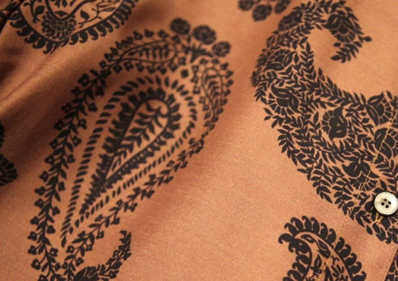
There is a lot of mythology around the paisley print. Some say it has ancient origins but came to the West in the 16th C. Others argue that it wasn't a thing in Europe until the 18th century. This is evident in multiple blog posts on the subject of paisleys.

Taken from Toast Magazine

I personally had been told the "no paisley in the medieval and Renaissance period" so many times, I figured it must be true.  Afterall, the closest thing I found for a while was this 17th century portrait which is just outside of the SCA period:

Taken from Tate
However, it looks like it's another "word" problem, similar to the word "pink".   Pink as a color existed in the SCA period but the word pink to *mean* the color did not.  The same seems to go for the word paisley.  

Paisley, in the SCA period, means the Scottish town which is just outside of Glasgow.  I've been to it and through it a few times.  It's a lovely manufacturing town which, as many sources suggest, is where the design paisley got it's name from when the weavers in the town Paisley started to turn out the design in the 18th century.   

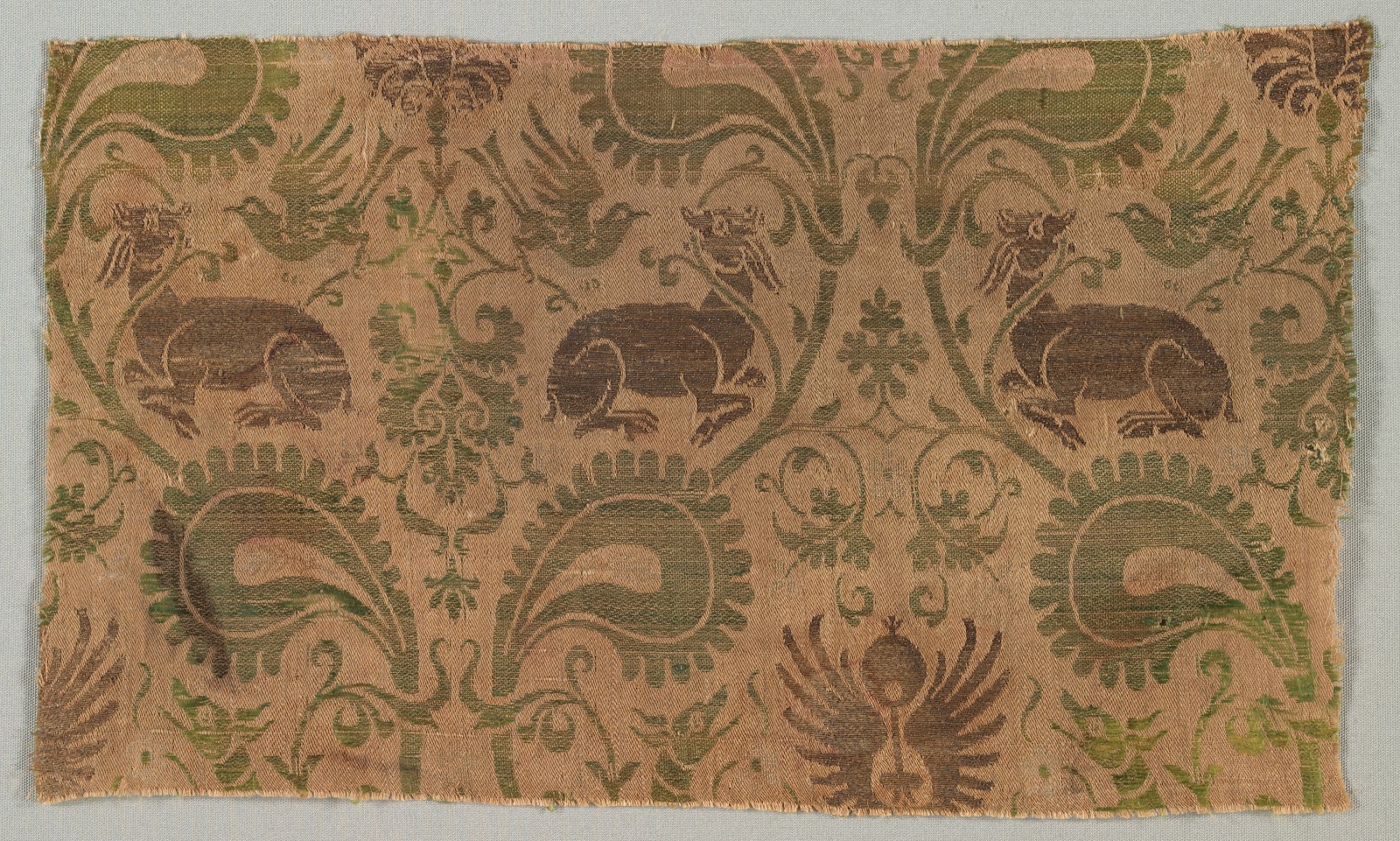
Before that?  I'm not sure if there is an English name for it.  However, the design itself did exist in Europe well within the SCA period. Here is the evidence:

Taken from the Cleveland Museum

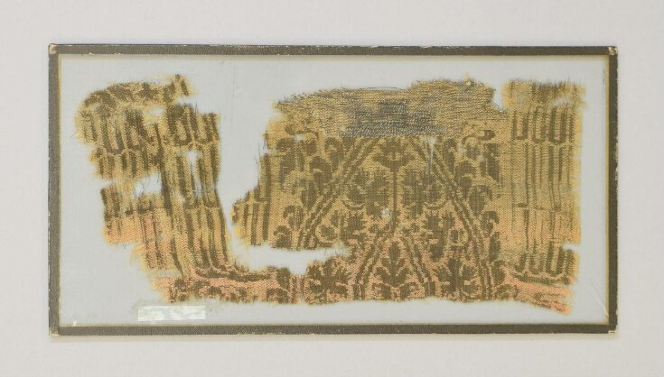
The above is a piece of silk lampas, manufactured in the second half of the 14th century...in Italy.  Those big green things below the heraldic dogs certainly look like paisleys to me!   To show it's not a one off, look above the back of the bird's head in this next 14th century piece.


Taken from the V&A Museum

It's also a fun one since it was made in Iran - where we know they did have paisley designs in the 14th and 15th centuries- but used in 14th century Germany for a dalmatic.  This also seems to be the more popular form of the paisley design as it shows up, again, in 14th Century Italy.

Taken from the V&A Museum


The more modernly common paisley shows up again in Italy in the 16th century.

Taken from the MET

As well as in 16th century Spain!

Taken from the MET


And one last late 14th century one that is Italian made, but found in France.

Taken from the V&A


Really, it looks like the paisley was fairly popular in 14th C Europe, though it is a part of other designs.  Hopefully, this will be helpful for anyone else trying to document the paisley into the later medieval period and up into the Renaissance era.   Now, I can safely say that even the design elements on my sari turned 1490's gown are period correct.  :-)


Edit to add:  I wanted to add this image as well:

While the Turkish lady is from the 17th century, her hat clearly has paisleys.  This, again, pushes that whole "18th century" idea back.  Plus, the painting may be as early as the 1610's.  

Thursday, August 10, 2023

New sheer handsewn linen camica


The camica laid out on my bed at Pennsic.   It's too sheer to model as it's out of 2.5oz linen I bought from Fabric Store.   


Close up of the neckline.  I used linen thread I would run through beeswax to sew the entire camica.   Each of the edges are rolled or are wrapped in what is essentially linen bias tape.   


Close up of one of the cuffs.  I still need to add twill tape or some sort of fastener to the cuffs.  

Overall, it took me maybe three days, on and off, to sew the camica up while at Pennsic?  This included cutting out the garment and going to classes or walking around.   It really didn't take too terribly long.

The pattern is very simple.  One yard of linen for the front.  One yard of linen for the back.  30" of  the linen, cut in half for the sleeves (so the "top" of the yard is one sleeve and the "bottom" is the other).  5"ish to make squares.  I cut the bottom of the front and back to make binding for the neckline and cuffs.  Overall:  3 yards of fabric used.  

It's very lightweight and perfect for summer.   I'll probably wear it to the North Carolina Renaissance Festival in a few weeks.  :-) 

Tuesday, July 28, 2020

Sari made into a 1490's Venetian dress


I made this back in May and forgot to post it.  Self-drafted out of a sari I found at a thrift store last year. Although the paisley pattern on the sari isn't accurate for the late 15th/early 16th c   (EDIT: Please see my latest research here on the paisley print actually being pretty accurate for the period) , the sari was too pretty to not be made into something.

The pallu of the sari ended up being the faux underskirt and the gauntlets. The bodice is made from the blouse piece and part of the hem of the original sari skirt. I cut up the sari skirt into five panels - three panels have a "flower" design on them and make up the overskirt fronts and the back of the dress. The plain (it has the hem treatment but not design on the body of it) parts of the skirt became the sides of the gown. The upper part of the skirt had a lovely trim detail that I cut off and made into the trim you see around the open front and around the faux front on the bodice.

It fits really well.  I can't wait for this COVID to be over and I can wear it to an event!

Sunday, September 8, 2019

Colors the Peasantry wore in the Middle Ages and Renaissance Part Two

In part one, we looked at various paintings that show the poor were anything but monochrome. Now, we'll look at writings and archaeological evidence that further proves the poor had dyed clothing.

I'm going to go with the most obvious first.  Why and how could the poor have access to dyes to have colorful clothing?  The easiest way was to get hand me downs.   Just like now, giving clothing to the poor was very much a thing in the middle ages and renaissance.  Works of Mercy included giving away clothing to the poor. 

There were also second hand shops; basically pawn or thrift stores, in the middle ages.  Again, it wouldn't be the latest fashion but it would be a way for someone with a few extra pennies to get a nice dyed garment that is a season or three too old to be fashionable.  Second hand clothes shops were essential to medieval life.

However, probably the most compelling evidence that the peasantry wasn't monochrome comes from the archaeological evidence itself.  In a study of textiles from both bog and grave digs in Northern Europe, all time periods, including 8th-10th C, showed indications of blue dye being used.  Sometimes, the blue dyes were found in conjection with a yellow dye - meaning that green was a probable color.  In fact, red appears to only show up in the wealthier graves but both blue and green are in the archaeological remains.

More fun is a test of textiles found in the waste layers from Medieval Prague.  172 samples were taken for dye analysis based on a dig site that dates from between the 14th and 15th Centuries.  The entire paper is here and is a fascinating read on it's own.  The 172 samples are broken down into (34 silk and 138 wool samples - which is slightly disproportionate to the overall finds.  Only 4% of the textiles found were silk.  However, some of the textiles were also items such as rope or other non-clothing piece as well as the silk pieces possibly being larger or more easy to test for dyes than some of the wool fragments.

Taken from a presentation by Helena Březinová
Of the 172 pieces tests, only 27 or 15% of all the samples had no dyes detected.  85% of the samples had at least one dye at this medieval dump site.  The dump site would have pieces from across the classes; however, those with estates would dump items on the estate.  (I've been to one too many archaeological field schools where you are digging in the trash pit for the kitchen of some sort of manor/plantation house.)  So, for this dump site in the "New Town" area of Prague, it's pretty safe to assume you are mostly looking at the lower and middle classes with only a few upper class textiles involved in the dump.

The coccid is most likely polish cochineal which makes for a nice variety of orange, pinks, and reds depending on the dye bath and mordant used.  Madder is more oranges and reds.  Cochineal is brighter and more pinkish in it's hue while madder is more the color of a natural Ginger's hair.  :-)  Brazilwood is another red; this one is most likely the east Indian stuff and not from the New World.

Woad gives you a beautiful range of blues.  Tannin dyes, most likely walnuts, gives an array of browns; from khaki to almost black.  Weld will give you primary color yellow. Persian berries is the one outlier and also gives you a neat yellow.

Basically, in this pit, you have a range of reds, woad for blue, some browns, and two different ways to get yellow.  You have your primary colors so any color, pretty much, is possible.  Again, this is the waste layers of a city - you'd expect to find a high amount of items from a variety of classes but mostly the lower and middle classes.  Only 15% has no dye.  Everything else comes in a wide variety of color.

Want purple?  According to this archaeological report, madder (red) and woad (blue) together (purple!) account for 19 of the 60 double combinations; it's one of the most popular.  The tannis were most likely used to give the dye a darker overall hue so the 2 pieces that show woad (blue), weld (yellow), and tannis (brownish) probably came out to a lovely forest green.

Granted, this is just one archaeological report but it does show that the lower classes had color.  How popular that color was, based on the other archaeological paper focusing on digs further north and a few centuries older, depended on both time and location - just like everything else in the SCA period.  So wear that pink tunic with purple trousers as a serf, it's completely period.  :-)


Thursday, January 10, 2019

Colors the Peasantry wore in the Middle Ages and Renaissance Part One

So, I ran across a post on the superiority of chemical dyes over natural dyes that stated the lower classes didn't even have access to colors before chemical dyes.  ......  The individual honestly believes that everyone who wasn't rich or upper middle class only wore white, brown, and black before the 19th C.   Now, I put that up in the "we didn't have color before the 1930s.  Haven't you seen the old films?!?" category.  I just found it rather strange that anyone would actually believe that old joke.

To help put an end to the idea that peasant=boring, drab colors, I figured I'd put a new compilation together regarding colors in the middle ages and Renaissance.  Here's the first post to the series I did last time on fabric types and colors available in the middle ages and Renaissance.  In that, I went over what was available to show that, for the SCA, there really isn't such a thing as "that color didn't exist yet!!!!".   If you can document it, you can wear it.  I documented everything from hot pink to lime green and eye blinding yellow.

The difference this time around is that I'll explore a specific class in the medieval society to see what they were wearing.   Yes, the poor wouldn't have been wearing the expensive dyes but they weren't wearing monochrome either.  I'm looking at paintings, written evidence, and archeology to show what colors were possible. 

Paintings

Now, I know a few people will say "paintings?! But those were highly stylized and meant to be pretty for the people viewing them, not true representations of life!"  However, I call bupkis on that idea.  First, there are just too many different illuminations and paintings that show colorful garments for the beggars and peasants that it just doesn't hold water. Second, as I will show with the archaeological and written evidence, the poor were wearing colorful garments.

St Stephen Distributing Alms by Fra Angelico, 1440's
Above is a popular motif in the middle ages and Renaissance - a saint distributing alms.  Any time a saint's life is shown, this is likely to show up at some point.  There are manuscripts, paintings, and drawings showing various saints handing out alms.  Since the alms are always being handed out to the poorest of the poor, it gives us a chance to look at their clothing. 

In the background, we can see the donor who commissioned the painting in a lovely green, with his hands in prayer.  However, in front of him are some examples of the poor in the mid 15th century.  The lady is wearing a peachy pink dress with a light blue scarf around her waist and arm.  The child in front of her is wearing a dusty mauve tunic.  Behind the lady is a poor man wearing a nice blue shade.   They may not be the brightest colors but they aren't monochrome either.

Saint Lawrence giving alms, Fra Angelico, 1450s
Just a few years later, the same artist depicted a different saint, Saint Lawrence, giving alms.   Here, one of the beggars wears a rather rich red. The little girl with the little boy to the right of the saint is wearing an old green dress.  The baby in his/her mother's arms on the left is also wearing green.  Although there are beggars wearing gray, black, and brown, there are also blues, greens, and reds.  Check out the guy wearing blue on the right's burgundy hosen.  Again, it might not be the best of colors but they aren't colorless either.

"Catherine of Cleves Distributing Alms" by the Master of Catherine of Cleves, circa 1440
Although the two paintings by Fra Angelico might have been considered a bit low key on the color, this one is anything but!  This illumination shows a lady wearing a worn green cloak, a rather nice rose pink hood, and a mauve dress.  The man begging besides her has on a very bright blue doublet and an orange boot.  In front of him is a guy with an older styled, patched up doublet in a light green with rose pink collar and cuffs.  These are nice, BRIGHT colors but given the holes and patches, they are all clearly beggars.

Saint Lucy giving Alms circa 1435


The gentleman at the front of the beggars may be wearing gray but check out the lady behind him!  She is wearing a rather nice wine purple with her black veil.  And the gentleman next to her?  A good orange outfit with a green cap.   Even the beggar wearing gray as blue hosen on.  These aren't boring colors.  They are very much dyed garments.


The Alms of St. Anthony', oil on wood painting by Lorenzo Lotto, 1542. Basilica dei Santi Giovanni e Paolo, Venice
This one is pretty much 100 years later than the others but, again, we see green on the bottom left and yellow, orange, and red.  Although there are some blacks and browns, the over all colors are pretty much like what, really, you'd see today on the street.  It's a good mixture. 

Now, the giving of alms isn't the only time we see the poor depicted in medieval and Renaissance artwork.  Another common theme is one of my favorites for other reasons: shepherds.  Anyone who knows me, knows about my love for Shepherd's huts.  Shepherds were not rich by any means; they were the working poor.  Often, they are shown in rags; but, mostly, they are shown in common, peasantry outfits.

I love these guys. Mister mis-matched hosen and his ruined hemmed shirt.  Look at what the shepherds are wearing.  Yeah, the one guy on the right is wearing gray...but with lots of red.  Mister mis-matched hosen has yellow, red, and blue.  He's wearing primary colors!  The lady in the back who has her shepherds purse with her is wearing a lovely shade of red as well.  Theses are not boring colors at all!

Heures à l'usage de Rome Bellemare, Noël (14..-1546). Enlumineur
In this, yes, the guy in the back is wearing boring brown and gray but the lady sheering the sheep certainly isn't.  She's wearing a lovely deep red and a blue overdress. 

Livre d'heures du Maître du Bréviaire de Jean sans Peur (Paris ou Bourgogne, vers 1413-1419
Again, some brown but lots of blues and reds.  This is pretty common through everything I've found - lots of blue and lots of red.  Other colors are less frequent.  There is a good reason for this and I'll show later in the writings and archeology of the period. 

MS M.1004, fol. 044v ca. 1420-1425
There is no question these guys are poor.  Look at the tatters the shepherd's clothing is in.  However, they have fabulous colors!  Pink, blue, yellow, and an orangy red as well as brown.  Another example of not boring colors. 

MS M.0179, fol. 076r ca 1480-1500
Tell me that isn't lavender purple the lady is wearing.  Again, blues, reds, and now lavender purple.  The shepherds are pretty colorful.

MS H.5, fol. 059v ca 1500
I had to include these guys too because more lavender purple but also that fabulous "dear me!" orange on the guy to the left. 

Despite the amount of evidence here that poor did not mean boring colors in the least bit, I know there will still be people who will claim "but these are paintings!  They are meant to be pretty!  It's not what was really worn!"   So, in the next post, I'll show some of the written evidence and the archaeological evidence of the poor wearing colorful garments in the middle ages and renaissance. 


Friday, October 26, 2018

Halloween: Vannozza Cattanei's gray/green archery dress in the Borgias Part 1

The problem - because there is always a problem before the start of a project: I wanted something Venetian for Halloween - living here in Veneto- but I didn't want to do the 1550's/1560's thing because I'm trying to lose weight again. I wanted a dress that will fit for a while - which are typically the higher waisted gowns. However, I have a TON of the early 16th C gowns and didn't want to add another to my already bloated collection. Solution?


This.

I saw the gown and was immediately in love. It's very similar to many 1520's/1530's styles. Also, I happened to have a nice five yards of a lighter gray silk stashed away that was perfect for this gown. I'm not coping it exactly - mainly because I'm trying to go with mostly stash fabric - but I'm trying to copy most of the lines. So, the back...


The sleeves are detachable. There is a seam at the back sides but it looks like it has a zipper (not very Renaissance...) up the center back. Because I want to wear this to SCA events later on, I'm just doing lacing at the back sides. Also, it helps with losing/gaining weight that way. The skirt is gathered around and appears to really be just the typical rectangles with maybe some extra in the back. Again, SCA events, I'm just doing rectangles because trains and SCA events do not mix. Ever.

To start, I'm using a base I made from McCall's pattern 2806:


Really, the only thing you need to do to the above pattern to make it perfect for 1490s/1500s is take out the darts in the bodice. That's really it. The skirt is already just three rectangles put together.

I modified it slightly more than that - the shoulder straps are a bit long and the neckline is umm...more early 1520s and not sensible for anyone more than an A cup? So I raised the neckline, cut the straps slightly, also made the width a bit tighter, and I drafted out the darts so I could use this as a base.


The base!   I knew I had to add an inch or two to lengthen the bodice; I also wanted to move the side seam a bit and square out the neckline.  So, first, I drew around the existing base in brown marker.
Then, I took a red frixion (the kind you can erase!) marker and matched up the existing base back with the brown outline I just did.  I wanted to mark where I was moving the seem on both pieces and make sure the curve of the armscye was preserved.  
I only moved it over an inch, really.  You can see the new "red" outline for where I moved the seam over too.  
Inversely, on the back piece outline, I drew a red line to mark the new back side seam.
This picture is a bit hard to see but I squared off the back neckline.  I ended up doing the neckline in the back even deeper than this once I tried the mock up on.  However, the red lines mark the new template.
Front side bodice piece!   It has the new squared neckline and is lengthened.   
However, I realized when I tried to draw the correct length for the back piece that I didn't have enough room.  I ended up erasing the back piece and redrawing it all a lot higher on the paper.  
New back piece as well!!!
Comparison to the original bodice front, with the dart pinched and the new bodice front for the 1530's dress.  It's a lot longer and the neckline is higher.  Still, I realized I had a couple more issues that needed fixing still.  The underbust/rib cage waistline was 2" smaller than my actual rib cage.  My ribs do not shrink like my waist will.  They just don't.  So I ended up adding a bit to the bottom of the bodice so I can breathe.   Also, I didn't like the shoulder strap angle on the front bodice piece so I changed that as well.
The lining fabric!   I'm using teal silk dupioni for the lining.  The actual dress is out of the fabric pictured below.
This is going to be the skirt front.  It's just a 45" cut of the fabric.  The pink silk is silk I had on hand that I thought went well with the lighter gray/silver silk.  The dark lines are hunter green velvet trim.
This is the fabric for the upper sleeve as well as some trim ideas for it.  I like the idea of the pink with the silver trim.  I ordered some light green trim but it's not good for anything more than knitting or crocheting - it's recycled sari ribbon that was sewn together hastily.  I might check out the trim store here in town but, this is the direction I'm going so far.  

Saturday, September 1, 2018

Städel Museum in Frankfurt Germany part three

This is a super picture heavy post but, hopefully, it will be helpful! Please, if you use any of the images, make sure to credit me and feel free to link back to the blog as well.

Northern Netherlands Master, Triptych of the Crucifixion with Saints and Donors, 1530s

This is the full painting

Here, you can see several donors and a couple of kids.  

Center left is Mother Mary with possibly James and Mary Magdalen.  I'm not sure who is supposed to be at the foot of the cross; perhaps Martha or Saint Helena?

This guy.  I love this guy.  Anyone that can wear Mickey Mouse ears to Calvary has my vote.  (Yeah, I know, not really Mickey Mouse ears but...it still looks ridiculous) 

This is the right wing of the Triptych.  Another three donors, possibly the Mom and two daughters?

Lucas Cranach's Crucifixion from between 1508-1510.

The full painting

Mary Magdalen is wearing a green velvet with gold dress at the foot of the cross.  Mother Mary and the other women are behind her.  Green has long had a reputation of being associated with ladies of the evening so it makes sense that Mary Magdalen would be shown wearing that color.

Close up of Mary Magdalen.

Albrecht Dürer's Job on the Dungheap painted in 1505

I love this because of the lady's dress.  She has a clearly red front piece with a very, very pink gown.  

Close up of her bodice and sleeve.  Also, notice it's not super stiff - she probably has on a bra of some sort with just the chemise, stomacher/front piece/whatever you want to call it, and the gown.  She also has a sheer partlet/scarf around her shoulders.

Hans Holbein's Sunday view of the Frankfurt Altarpiece from 1501.

The piece was huge.  This is the overall look.

I focused on getting close-ups of the bottom piece.  It starts with Palm Sunday and then the Cleansing of the Temple.

In this one, the Cleansing of the Temple is on the left with the Last Supper on the right.

This is just a slightly better picture of the Last Supper.

Jesus washing the feet of his disciples with part of the Agony in the Garden.

A much better look at the Agony in the Garden.  I love all these because of the richness of the colors.  Yes, there are a lot of blues but also a lot of greens and reds/pinks.  They did have colors!

This is a close up from the lower right panel of the altarpiece.  It shows the three women carrying jars to anoint and clean the body of Christ on Easter Sunday.  I am in love with the white dress.  It's hard to see here, but in person, you can see the pins holding the dress front closed.  The lady in the red veil has on a nice darker green dress that just would not come out in the photos.

This guy is from the far left panel of the altarpiece and I love his teal, lemon yellow, and pink scarf outfit.  I can easily see a guy today wearing a shirt with the same print as his tunic and a pair of blue jeans.  

Conrad Faber von Creuznach's Double portrait of Justinian von Holzhausen and his wife Anna from 1536.

Showing the painting overall.

Close up of her green dress with black velvet trim, lined in red silk.

Close up of the mirror reflection showing the back of her hat.

Close up of her hat and chemise.

Mathis Gothart Nithart's painting of Saint Lawrence and Saint Cyriacus from 1509/1510.

Saint Lawrence who is the guy, during his martydom, quipped "Flip me over, I'm done on this side" while being grilled - literally. 

Saint Cyriacus was a Roman era martyr who is credited with exorcising demons.

Close up of the woman in the painting

Close up of her dress.  You can clearly see the dog-legged closure for the gown. 

The Stalburg portraits from 1504

Both full length portraits!   These are so incredibly rare - particularly of someone that isn't royalty.  

Close up of the woman's bodice and closure of her dress.

Close up of her hat

Better close up of the dress.  It's clearly out of watered silk (moire) in person with velvet trim and a fur lining.

The opening of the dress goes all the way to the floor which is pretty rare

The hem of her gown

Han Holbein's Portrait of Simon George of Cornwall from the late 1530s.

The full painting.

Close up of that lovely gold and blackwork

Lucas Cranach's Altarpiece of Holy Kinship from 1509

This was on the backside of the altarpiece and would have been seen when the altarpiece was shut.

The full altarpiece

I love the little boy's gown in the green and pink!

The gentleman is wearing a wide sleeved coat, lined in a very bright pink, with green hosen.  The lady has on a red gown that's hard to make out but she does have an early French styled hood on.

The guy has on a pink, yellow, and blue outfit with red hosen.  The lady has a gold gown lined in pink silk.

Pfullendorf altarpiece from between 1497-1503

Here is the full altarpiece showing the Annunciation, Mary visiting Elizabeth, the Nativity, and the death of the Virgin.

The Annunciation

Mary, in blue, visiting Elizabeth, in purply plum and red.

Close up of Elizabeth's sleeves

The nativity

Death of the Virgin

The crucifixion from 1500 (sorry for the blurry photo!).  This is actually a very famous triptych that I know circles around the SCA like wildfire.

The left panel.  There is so much wonderfulness in this.


Starting with the lady on the bottom left:  the green cloak, the blue kirtle with short sleeves and the wide red sleeves under.  The white veil wrapped around her head.  It's all awesome.  

Veronica wearing the wrap hat (this is seen in several other paintings of the time to the point I made a page about it YEARS ago.  I think I last updated the link about 10 years ago?  Anyway, this is shown in the link as well with the dates being about 10 to 20 years earlier than what the museum now says.   

This is from the right half of the left panel.  I actually like the pleated white dress with the red sleeves.  

This dress is very famous in the SCA garbing circles.  The red kirtle is open in the front and shows that the lady is wearing something black underneath.  The black, however, only extends to the waistline.  It's now thought this is just an underbodice/bra.  Also, the green sleeve is pinned to the short red sleeve.

Mary and probably one of the other Mary's or Martha.

This is from the center, I think.  I wanted to get some good photos of the guys' clothing as well.  

Center showing a wide variety of colors.

Center and I'm a sucker from stripes.  Showing peasants wearing rags, as with the guy in blue, was common.  It's rare to see patches although they do appear once in a while.

That turban though....

This is from the right panel.  Guys on horses looking like "Oh, isn't that interesting?" ....

Lucas Van Valckenborch's View of Antwerp with the Schelde Frozen Over from 1593.

The full painting.

I had to get a close up of the lady in yellow who fell down.  Notice her red muff to the side and people rushing to help her.

Good old fire to roast things on.  Hot Chocolate was still an upper class drink at this point (it did exist!) so maybe chestnuts?

Gotta bring more wood for the fire.  Here, you can see the lady with the firewood on her head's jacket and red wool (?) petticoat.  There is also a black line at the hem.   The more upper class couple have long cloaks on and hats.

I want this sleigh.  That is all.

Lucas Van Valchkenborch's Winter Landscape with Snowfall near Antwerp from 1575.

The full painting.

Patches!  The kid almost out of view has blue patches on his/her cloak.  Also, s/he appears to have a knit cap.  

Just warming up near the fire.  Not a bad idea.  

Pink pants with a red doublet.  

The family appears to be middle class or upper middle class.  One of the things I always forget to do to my own garb and something I've rarely seen are those black bars at the bottom of the skirt.  They appear to be common in period for those with any sort of money.

Hockey game because...necessary.

I'm not even sure what is going on but it does look fun.

Pieter Aertsen's Market Scene with Christ and the Adulteress from 1559.

I LOVE the market scene paintings.  I really adore this one because the common folk are upclose and you can see the details of the clothing.

Straw hat, yellow underdress, blue overdress, pink apron and sleeves, partlet, and you can see how the dress is laced easily.   

The girl in the background has her hair sewn up with ribbon, a black partlet and apron, and a red dress.

Olive green sleeves that are pinned on.

I love this old woman.  Ankles are totally period.  And see the wooden clogs the guy is wearing!  They both look quite relaxed.

Her outfit is almost camouflaged for her stall.  

The adultress is wearing an upper class style gown.  The lighting made it hard to get a good photo.

Close up of the pinned on sleeve and the waistline of the lady in the center front.

The fuzzy pink hat.  I know there are tons of guys in the SCA that would love to make this.  I really want this to be a thing now. 

Mount Calvary painted between 1435-1445.

This is of the full painting.  Notice the amount of colors!  Greens!  Blues!  Pinks!  Reds!  Oranges!  Yellows!  Heck, the guy directly behind the Cross is wearing purple with a green hat!

But it's this guy in front of the cross that made me smile.  Unfortunately, there are still some in the garbing world who are under the belief that back lacing wasn't a thing until the mid 16th C.  See the guy in yellow?  Yeah, his armor is backlaced.  It's probably allegorical but the concept of backlacing existed at least in the early 15th C.  

Mother Mary, James, Mary (or Martha), and Veronica.

Close up of the right side of the painting.


And that's it!   My album of all the photos I took in Germany is through the link.  Again, if you'd like to use any of the images, please either link or document to this page.   I hope these help!